Introduction
RStudio can be used for a lot of the features that Wolfram Mathematica is often used for, and best of all, RStudio and R are open source and free.
Although I had access to Mathematica during the Maths subject in my Data Science course, I prefer to use software that I can continue to use afterwards, so I came up with ways of using it in place of Wolfram Alpha / Mathematica. A lot of it was not very well documented, since it isn’t a common use for it, so hopefully this helps a few others.
NOTE: If you run the code in R-Studio, you can rotate the 3D plots as well
Differentiation
Differentiation of (3/2)x^2 + 5x + 2 + 70/x
# In R-Studio, you may need to go to Tools -> Install Package and choose Deriv
library(Deriv)

# Set the function and the derivatives
fx <- expression((3/2)*x^2 + 5*x + 2 + 70/x)
dfx <- Deriv(fx, "x")
ddfx <- Deriv(dfx, "x")

# Display output
cat(paste("Given f(x) =", fx), "\n", paste("-> f'(x) =",
           dfx), "\n", paste("-> f''(x) =", ddfx), "\n")
## Given f(x) = (3/2) * x^2 + 5 * x + 2 + 70/x
##  -> f'(x) = 3 * x + 5 - 70/x^2
##  -> f''(x) = 140/x^3 + 3
Plotting a function
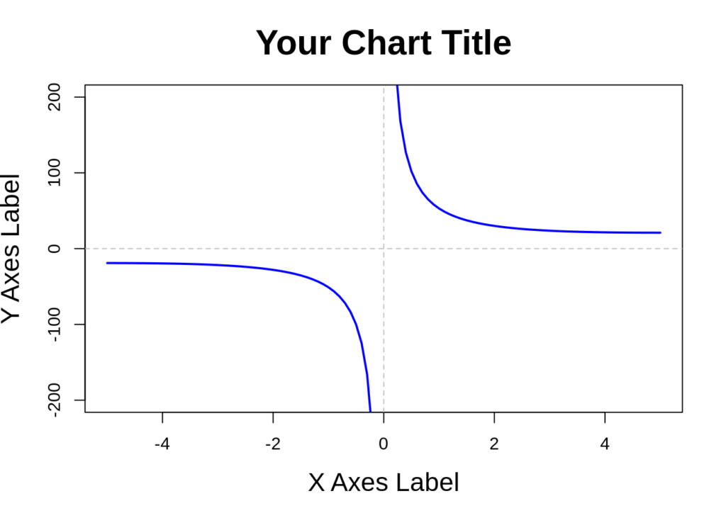
In this example, we plot the function f(x) = 2x + 1 + 50/x, with x axes from -5 to 5 and y axes from -200 to 200.
# function definition and parameters
f <- function(x) 2*x + 1 + 50/x

# Create a function to draw x and y axes with dashed lines
draw_axes <- function(){
  # Draw dashed line for x and y axes
  abline(h=0, untf=FALSE, col="gray", lwd=1, lty=2)
  abline(v=0, untf=FALSE, col="gray", lwd=1, lty=2)
}

# Set the minimum and maximum values for x and y
xlim <- c(-5, 5)
ylim <- c(-200, 200)

# Draw the curve
curve(f, main="Your Chart Title", xlim=xlim, ylim=ylim,
      xname="X Axes Label",
      ylab="Y Axes Label",
      col="blue", # color of the line
      lwd=2, cex.main=2, cex.lab=1.5);
# Draw the axes
draw_axes()
Plotting a Relation in 3D
In this example, we plot the relation f(x,y) = x^3 + 3xy^2 – 12x + 3y^2 using the Plotly library.
# Use the plotly library to plot our surface
library(plotly)

# Specify the primary relation as a function called f
f <- function (x, y) {
  return (x^3 + 3*x*y^2 - 12*x + 3*y^2)
}

# Create values of x and y to plot
x <- seq(-4, 4, by=0.25)
y <- seq(-3, 3, by=0.25)
# calculate z based on the relation for each point of (x, y)
z <- outer(x, y, f)

# This is really important - transpose z, as plotly expects the data in this format
# I spent many hours trying to figure out what was wrong!!!
zp <- t(z)

# Use Plotly's surface plot feature
plot_ly(x = x, y = y, z = zp, type = "surface", colorscale='YlOrRd')
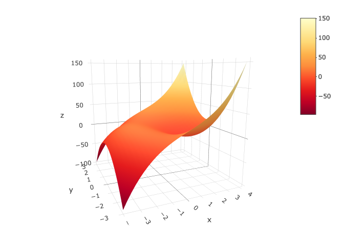
# Note: other available colorscales:
#      [‘Blackbody’, ‘Bluered’, ‘Blues’, ‘Earth’, ‘Electric’, ‘Greens’, ‘Greys’, ‘Hot’,
#       ‘Jet’, ‘Picnic’, ‘Portland’, ‘Rainbow’,‘RdBu’,‘Reds’,‘Viridis’,‘YlGnBu’,‘YlOrRd’]
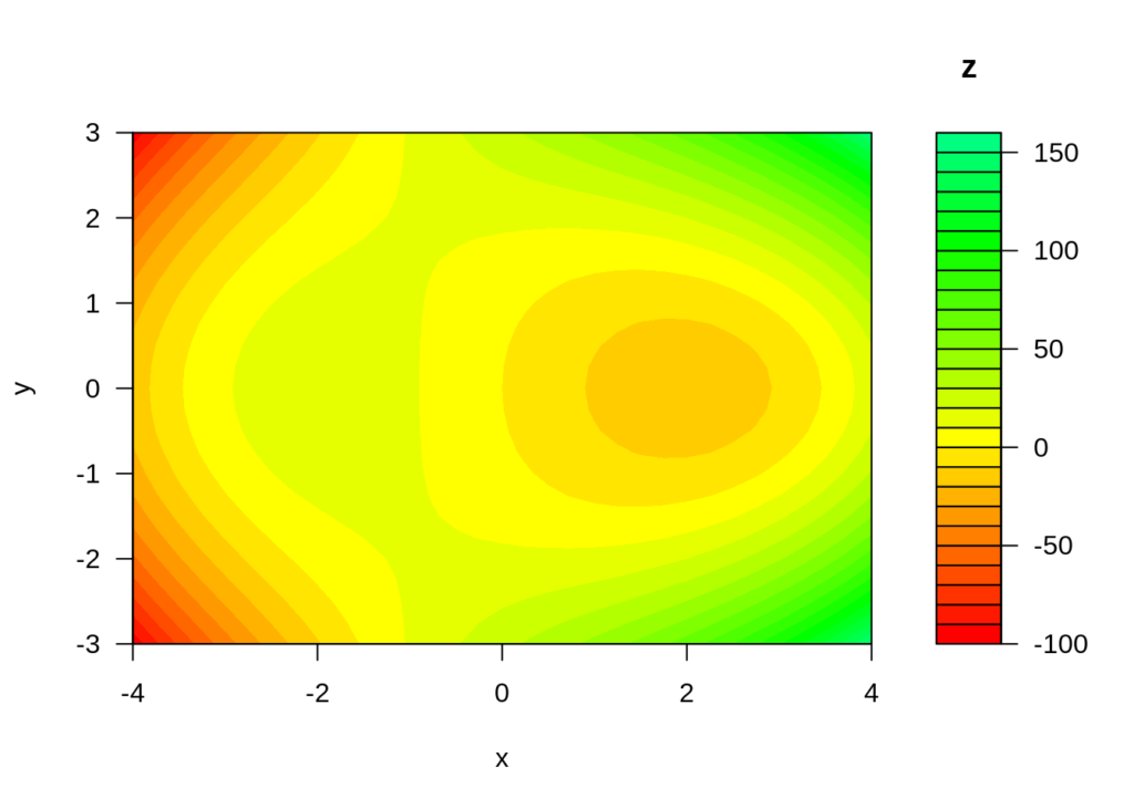
Creating a Contour Plot of a Relation
Here’s a contour plot of the same function above.
# Set a color scheme for the contour plot
cols <- rainbow(60)
# NOTE: other available colors are:
#      terrain.colors(25), cm.colors(25) heat.colors(25, alpha=1, rev=FALSE),
#      rainbow(25), topo.colors(25)

# Draw the contour plot
filled.contour(x,y,z, nlevels=25, col=cols,
               ylab='y', xlab='x',
               key.title= title('z'))
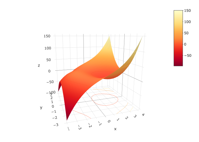
Plotting a Relation and Contours in 3D
Using the same relation, this time projecting contour plots in the 3 dimensional plane..
fig <- plot_ly(x=x,y=y,z=zp) %>% add_surface(
  colorscale = 'YlOrRd',
  contours = list(
    z = list(
      show=TRUE,
      usecolormap=TRUE,
      highlightcolor="#ff0000",
      project=list(z=TRUE), # this projects them onto the plane below/above
      # control size of lines between contours, and when they start and end
      size=50,
      start=0,
      end=1500,
      showlines=TRUE
      )
  )
)

fig
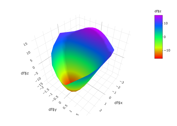
Bounding a relation with another relation
Let’s say that we now only want to see the relation f(x,y) = x^3 + 3xy^2 – 12x + 3y^2 plotted where the values exist within the boundary of secondary relation.
In this case the secondary relation is an ellipse specified by x^2 + 3y^2 = 12, so we want to bind everything within x^2 + 3y^2 <= 12.
# Create function of the first relation that only returns values within the
# bounds of the secondary relation
fn <- function (x, y) {
  if ((x^2+3*y^2) <= 12 ) {  # The secondary relation
    out <- (x^3+3*x*y^2-12*x+3*y^2)   # Return the value from the primary relation
  } else {
    out <- "NULL"
  }
  return (out)
}

# Generate a dataframe called df,  with two columns x and y,
# containing an array of combinations of x and y that we used earlier
df <- merge(data.frame(x=x), data.frame(y=y))

# Create a column holding the result of the relation on x and y
vecFn <- Vectorize(fn, vectorize.args = c('x','y'))

# Insert this new column into our dataframe df as column z
df$z <- vecFn(df$x, df$y)

# Now drop all values that are the function fn we created marked it as null
# (ie remove items outside of the bounds)
df <- subset(df, z != "NULL")

# Convert the z column to numeric (since before it had strings of "NULL" in it)
df$z <- as.numeric((df$z))

# Finally, plot the dataframe
p <- plot_ly(df,
             x=~df$x, y=~df$y, z=~df$z,
             type='mesh3d', intensity=~z, colors=colorRamp(rainbow(5)))
p
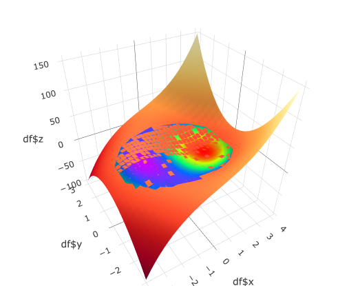
Projecting the bounded relation onto the primary relation
Lastly, I would like to see how this bounded relation appears on top of the original relation. The result below isn’t perfect, but it gives you an idea.
# plot the two together using the subplot
primary_surface <- plot_ly(x = x, y = y, z = zp, type = "surface", colorscale='YlOrRd')
bounded_surface <- plot_ly(df, x=~df$x, y=~df$y, z=~df$z,
             type='mesh3d', intensity=~z, colors=colorRamp(rainbow(5)) )
subplot(primary_surface, bounded_surface)